[ad_1]
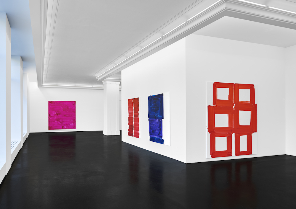
Installation view of “Beth Letain: ultrapath” at Peres Projects in Berlin.
MATTHIAS KOLB/PERES PROJECTS, BERLIN
The clarity and integrity of Beth Letain’s pure, punchy abstractions are desperately needed relief in our relentlessly overstimulating world. Her massive paintings are just gestural expression of strong color on clean white yet they are also much more. The velvetiness of her textures and the vibrancy of her colors pull you in and then calm you down. Although her brushwork is complex and physical, it has no gimmicks or frivolity. It is direct and confident, like the artist, while feeling kind and charming. Letain likes a purple that is, definitely, purple and a pink that shocks. Her shapes are not flawless but feel sincere, with a timeless simplicity.
Letain grew up in Canada, studied at Nova Scotia College of Art and Design in Halifax and McGill University in Montreal, and now lives in Berlin. As an artist based in places not known for natural light, the intense colors of her paintings evoke a special gratitude. She had her first major solo show at Berlin’s Open Forum in 2017, followed by “The Company She Keeps,” at Peres Projects in the city the same year. Her latest show, “ultrapath,” is now on view at Peres. We met for coffee, on a typically gray Berlin day, to talk about how her paintings need no explanation.
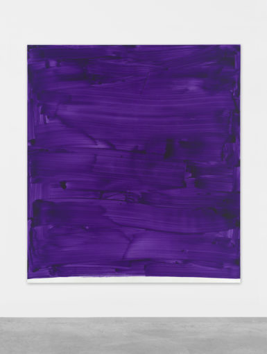
Beth Letain, Dayfall, 2019.
MATTHIAS KOLB/COURTESY PERES PROJECTS, BERLIN
Ana Finel Honigman: Tell me about the white in your work. There is much less of it in your current series of paintings at Peres Projects, but it remains a strong signature of your work.
Beth Letain: White is very prominent. I’d always been more a drawing person than a painting person. I realize that, over time, I am making surfaces that mimic my drawing paper. I draw on white or cream paper. The drawings have a sensibility that I love and I want to not just replicate that but convey a similar sentiment, to the looseness and freedom of drawing. I am less obsessed with the white canvas than trying to correlate it with the drawing process.
AFH: The white is not a nothing. It feels more complex. It is physically more there. It is not the negation of something but a presence.
BL: It is. I do not buy pre-prepared canvases. There is something slightly perverse about spending two to three days building up this primer, and the paintings themselves, the actual act itself, when it really falls together, can take 20 minutes. I invest all this in a surface and then walk up and . . . bop!
I like the nonchalance, but it’s ballsy with such strong colors.
I know that, for some people, my colors are too astringent. There is all this white, but it’s bouncing off a heavy blue or bright red.
What motivates that and what does that mean to you?
I do a lot, a lot, of drawing. That is the fundamental base for everything that I do. It’s on a really small scale, the size of your phone, index-card size. And I make loads of these drawings with gouache and watercolor. I am reaching around with form and color in these drawings. I usually produce a lot of these drawings. I am trying to find the ones that buzz.
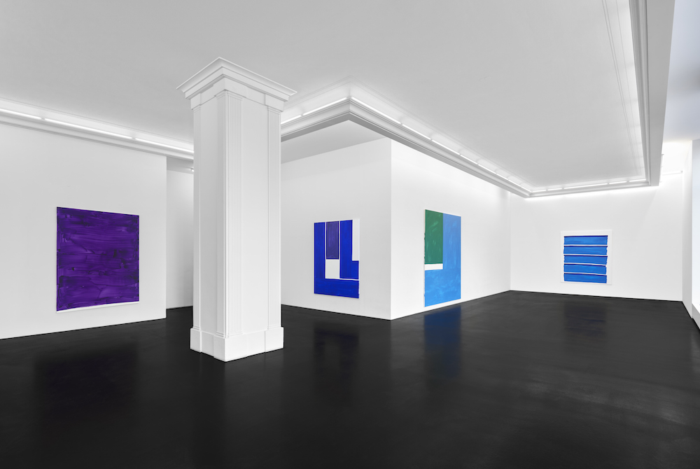
Installation view of “Beth Letain: ultrapath” at Peres Projects in Berlin.
MATTHIAS KOLB/PERES PROJECTS, BERLIN
How?
There is something in it that makes me want to make a painting. I’ve come to realize while doing it that I don’t know whether the color or form come first. The form is what I am interested in and then I need to figure out what color belongs to it. I can’t make it in any color.
Synesthesia?
My sister has that. She will hear a number and see it in purple or red. For me, if there are two rectangles coming together then they have to be orange.
It sounds like you’re a fiction writer creating these characters.
In a way, yes. It is an intuitive logic. There is some logic to it.
Do you ascribe consistent personalities to particular colors?
I am realizing no. I’ve been producing more in the last couple of years than recently. I have more shows and more deadlines. It’s been great because it’s helped me clarify a lot of things. I was happy with the way I was working before, but having these outside demands forces me to make decisions about what I am doing. It’s making me see that I definitely prefer some colors to others.
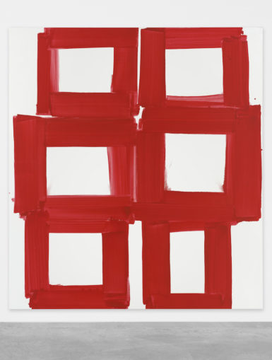
Beth Letain, Antidote, 2019.
MATTHIAS KOLB/COURTESY PERES PROJECTS, BERLIN
Did you not know that before? Isn’t “What is your favorite color?” one of the top getting-to-know-you questions from kindergarten onwards? That seems to build bridges between people.
I thought I was very egalitarian in my treatment of colors. I thought I loved them all equally and was mostly interested in how they sit with each other. I had a relational sense of color, but I just finished a show that was largely red, orange, and blue, for some reason. I wasn’t doing it on purpose but red, white, and blue have a lot of associations for most people. For me, it was just fun to play around in that realm. I had a turquoise and tomato red. I had all the variations of those colors. All these colors can have such resonance with people.
What resonates is obviously zeitgeist-related but also just quirky. That’s why we, on an animal level, are gathering a lot of information about each other from clothes and style. Dogs sniff and we sniff out style.
I think about this a lot. I have artist friends and I like and respect their work because I know them but maybe it wouldn’t be to my personal taste otherwise. It’s been very interesting over the years of knowing people with strong aesthetic senses to wonder, “Is this inborn, or did you develop it?” Because I have my particular set of what I’m drawn to. In our clothing, the plates we eat off of, the stuff of our lives, it’s always a chicken-and-egg process of decoding where these things originate.
People have a physical response to color. Do you study the psychology of color?
I read David Batchelor’s Chromaphobia, the social history of color, as an undergrad. I haven’t gone in-depth. I was always interested in color. Even as a little person. My Dad is color-blind.
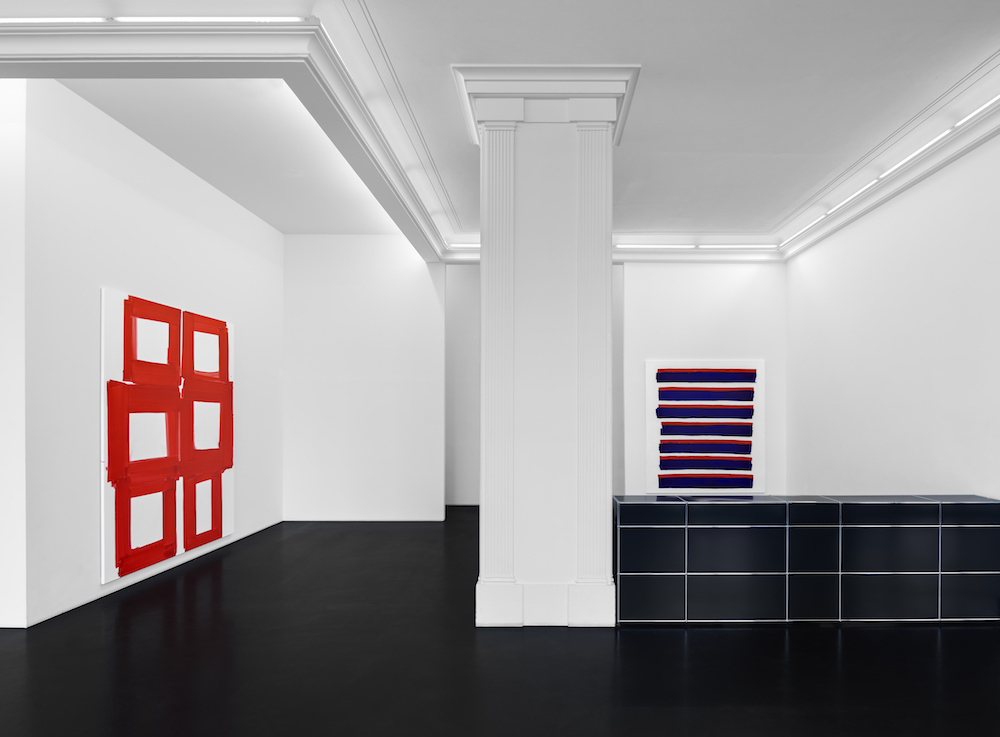
Installation view of “Beth Letain: ultrapath” at Peres Projects in Berlin.
MATTHIAS KOLB/PERES PROJECTS, BERLIN
Oh wow.
It was funny growing up in a home where one person can’t see the full range of color that you’re seeing. When I was a kid, I remember he would memorize the order of stoplights. If my mother was out of town, I had to choose his socks. All dark colors looked the same to him. There are different kinds of color-blindness. My father has red/green. He explained it to me as not always being able to distinguish colors of the same value and when I was younger I would always wonder what it was he saw.
How has this influenced your relationship to color?
I became aware, relatively young, that we do not all see the same things. But, when I contextualize my work, I keep it formal. I am pretty disinterested in placing it within my personal narrative. That might be related to being a woman because I don’t want that to be an easy hook.
Women traditionally needed to make personal and subjective work to validate it. By asserting a role as a witness or subjective entity, a lived experience, a woman could try to access credibility.
That is valid but when I’m making this reduced, formal work, I don’t want to have to validate it through my lived experience. My ability to work with form and color is the same as anyone. I steer clear of hooking my work onto any personal narrative but I am also never dying to know the particulars of who made a thing, if I like the thing.
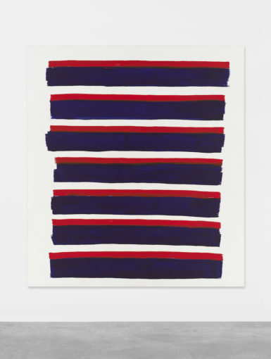
Beth Letaine, Eine Geschichte, 2019.
MATTHIAS KOLB/COURTESY PERES PROJECTS, BERLIN
But we are communicating something when using particular colors. And who can use color. It’s a fascinating moment in history when women wearing pastels in professional contexts can signify power when women
were initially directed to blend, using gray and navy to move ahead.
I agree with that point but still feel ambivalent because it’s always so linked to capitalism. The idea that empowerment comes through visual signifiers means it’s always vulnerable to being marketed and sold.
I agree. What is Fifty Shades of Gray? I haven’t read much of it, but I skimmed enough to know it’s not sexual transgression, or a power dynamic, but a shopping list. Of course, it’s a strangely socially supported trend. As for the idea of “power pastels,” they get dirty quickly and you need to be in a cloistered, airless office to maintain the look, whereas black is accessible because it retains its appearance longer and under greater duress.
I had a lot of black tights. They looked put-together with anything. My friend said they’re an interesting mark of working-class women. If you’re in a service job, black tights are a funny kind of indicator. You wear this piece of clothing that can get dirty or be worn a lot of times. It’s interesting how class and power can be transmitted by color aesthetics.
Color is coded and projects meanings. I’ve mostly learned that through travel and living in a few different cities and countries. The use of color in daily life in Latin America is, clearly, completely different from Northern Canada, for example.
I love touches of pastel around Berlin because there is no light here. A little reprieve from the otherwise milky wash of grey.
It is endlessly fascinating to me. The cultural, social, and emotional resonances of colors are all interconnected and subject to change, because we live in a world, and we all learn and develop meanings for what we see.
[ad_2]
Source link

