[ad_1]
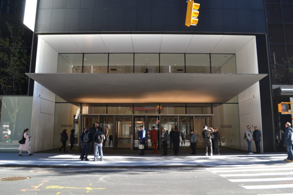
The view across West 53rd Street, into the belly of the beast.
PHOTOS: ANDREW RUSSETH
Entering the newly expanded Museum of Modern Art, it immediately becomes apparent that this is an institution prepared to do very big business. An almost comically long row of empty chairs in the museum’s cavernous lobby will be home to ticket sellers as soon as the museum opens to the public on October 21.
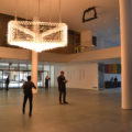
That lobby, which spans a Midtown Manhattan block, has been made even larger by pushing back some of its walls and moving into space next door that was once the American Folk Art Museum—the quirky, lovable Todd Williams and Billie Tsien–designed building that MoMA bought and demolished after its occupant ran into financial trouble. Brightly lit marquees by Philippe Parreno float high in this even-more-capacious hall, which is ready for the inevitable crowds.
One could be forgiven for feeling a sense of déjà vu. It has been only 15 years since the last MoMA expansion. That one was by Yoshio Taniguchi and came in at $858 million, about $1.2 billion in today’s dollars. It was impeccably elegant but also, woefully, corporate—a nowhere place, a destination that generated respect but not much affection. Worst of all, it proved to be too small, both for the museum’s ambitions and for its audience, which now runs to about 3 million people a year. Visiting on a crowded day is a deeply unpleasant experience.
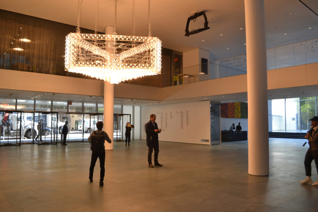
In the nearly empty lobby, a Philippe Parreno glows.
Now it is Diller Scofidio + Renfro’s turn. The firm is famous for its endlessly imitated High Line Park and, more recently, infamous for its bewildering, foreboding Shed in Hudson Yards, the multi-hyphenate arts center that it increasingly seems no one but a few super-high-net-worth individuals actually wants. Collaborating with Gensler, DS+R has delivered for MoMA an addition and renovation for $450 million, which is a modest sum from a certain vertiginous angle point. (The priciest apartment in the soaring Jean Nouvel tower that shoots up from the addition runs north of $60 million.)
Entertainment mogul David Geffen gave $100 million and got naming rights for the new wing. Hedge-funder Steven Cohen and his wife Alexandra gave $50 million, and their names adhere to the special-exhibition spaces on the sixth floor. It’s a nice coincidence that MoMA’s unveiling is occurring just days after a new study stated that the wealthiest 400 Americans now pay a lower tax rate than anyone else in the country for the first time in history. There’s a lot of money sloshing around in certain bank accounts, and that is a very good thing for a very few superstar museums.
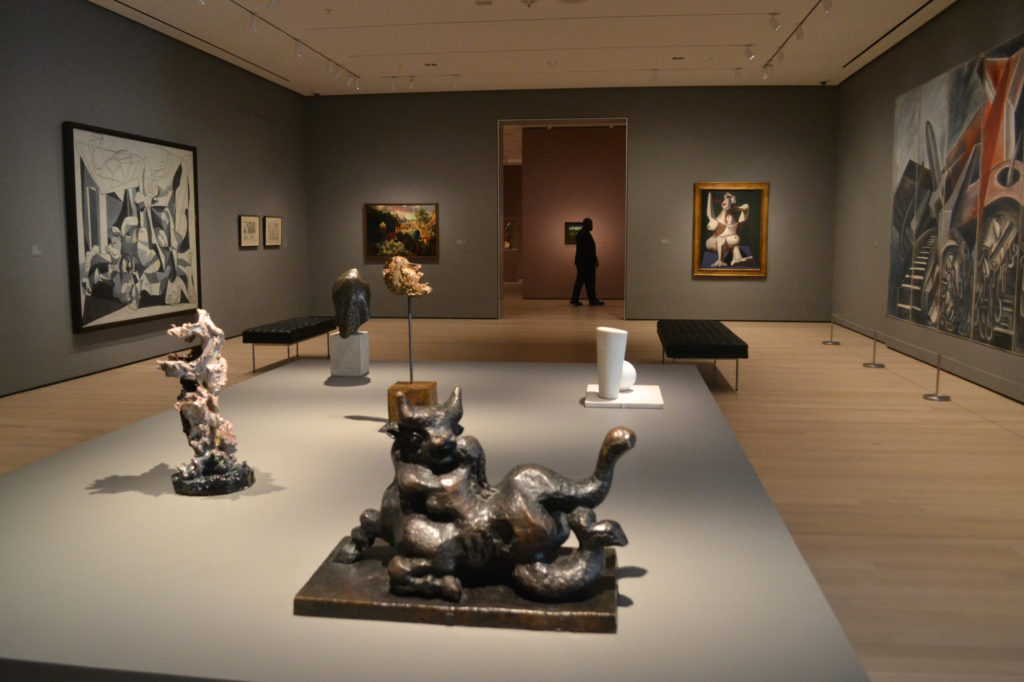
“Responding to War.” Naming its galleries, the museum has eschewed the titles of movements and styles in favor of more approachable themes.
Build, Baby, Build
So how is the new MoMA? Sumptuous, luxurious, and wisely conceived, I am happy to report. Some of its longstanding architectural problems remain, and it is still quite corporate—too sleek for its own good—but it would have been foolish to expect that to change at this point. (Michael Kimmelman nailed it with his recent Apple Store analogy.) Those who visit the museum only occasionally will find their next visit to be pleasant and familiar. For my part, I found myself getting not-unhappily lost in some of the permanent-collection galleries on the upper floors, but I suspect I will get acclimated soon enough. It is all right angles and mostly sensibly proportioned spaces—a lovely place to visit, at least in these early preview days when very few people are there.
If all of this praise sounds a bit lukewarm, consider how many museum expansions go awry. Think of Daniel Libeskind’s horrendous, pointlessly angular Denver Art Museum or Herzog & de Meuron’s awkward extension of the Walker Art Center in Minneapolis. MoMA has avoided such mishaps, and instead focused on honing its strengths.
It may seem crazy to write in praise of a stairwell, but it is a key reason for the new museum’s success. DS+R has placed these stairs where the Folk Art Museum used to be (and added new elevators right by them), and they run the full height of the building, along a soaring wall of glass that allows you to orient yourself to the street and enjoy uninterrupted views of the city. The museum feels just a tiny bit less like a fortress than it used to. Perforated wood panels line the walls and keep things hushed. I found my blood pressure dropping as I ascended.
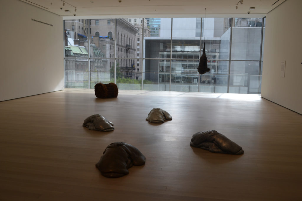
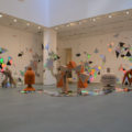
“New Monuments,” with Lynda Benglis up front and Jackie Winsor in back.
But such well-considered details aside, the most important thing is this: MoMA is now gargantuan, with 166,000 square feet of exhibition space, 30 percent more than before, which places it about even with the San Francisco Museum of Modern Art, the leader in the real-estate charts since its own Snøhetta–designed expansion three years ago.
The idea of going to this capital of modernism and seeing it all in a day has been a questionable notion since the 2004 expansion. It is now impossible. It is a two-day affair, or an all-day outing when it is open late, so long as you have a quick lunch and dinner on-site. (And why wouldn’t you, with Danny Meyer at the helm of the eateries?)
After a four-month closure in order to complete work on the construction, MoMA has returned. Thank goodness. It is one of the city’s—the country’s—great treasures, and while this expansion does not mark a sea change, it is a net plus. It feels good to have it back in this way.
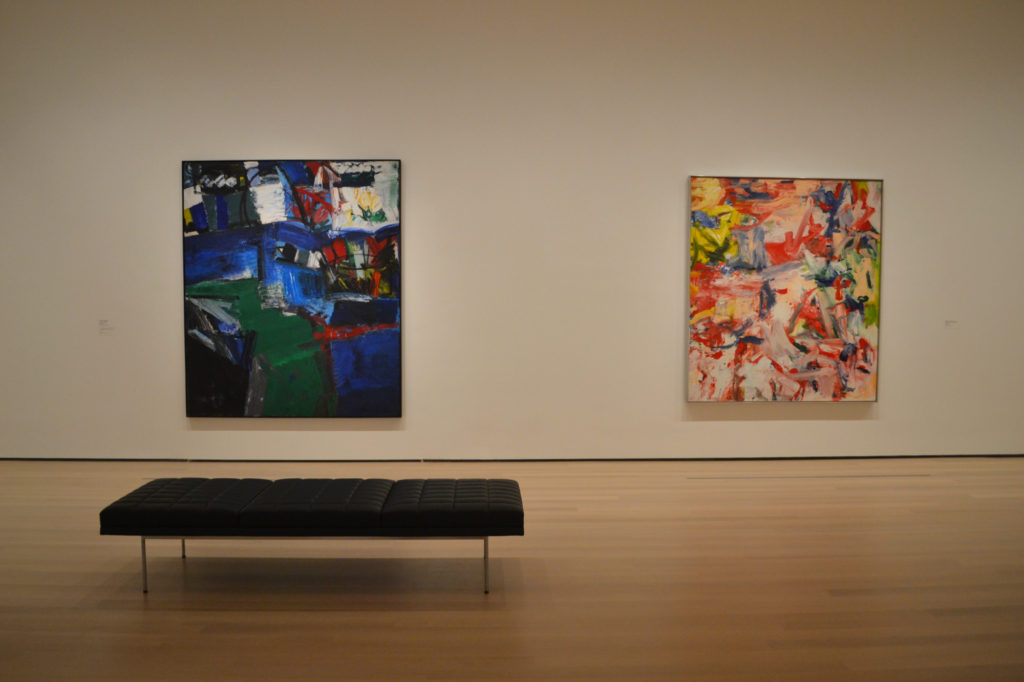
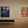
Two old comrades side by side: Grace Hartigan’s Shinnecock Canal (1957) and Willem de Kooning’s Untitled XIX (1977).
Take Up the Collection
In the run-up to the reopening, much has been speculated about the curatorial changes in store for the display of MoMA’s permanent collection. As it is, under the aegis of its gimlet-eyed chief curator of more than 10 years, Ann Temkin, MoMA has been making strides in telling a broader, more complex story of modernism, which it had previously long defined as very white, very male, and very Eurocentric. Thankfully, Temkin’s revisionism has continued apace in this rehang. Almost every gallery is housing collection works in these opening months, and some exhilarating experiments—and even some hints of playfulness—are in evidence.
This is not to say the MoMA curators have condemned the likes of Picassos and Duchamp to storage. The hits are all here. A jaw-droppingly beautiful bounty of Brancusis has the whole fifth-floor space that once held Café 5. An adjacent gallery devoted to the late 19th century still holds van Gogh’s Starry Night (1889) as well as other usual suspects like Gauguin. But there is also a handful of irresistible ceramics from about 1900 by George E. Ohr in physics-defying shapes.
The presence of the “Mad Potter of Biloxi,” as he called himself, feels out of place, but such confusion is a charm at long-uptight MoMA, with its notoriously circumscribed notions of taste and teleological history. Ohr was just four years younger than van Gogh, and though they embody very different traditions, why not show them together for a bit and see what happens? After all, a third of the collection galleries will be rehung ever six months, meaning an entirely refreshed MoMA will now arrive every year and a half—that’s quicker than power can change hands in the United States House of Representatives.
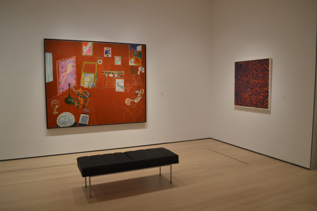
Matisse’s The Red Studio with Alma Thomas’s Fiery Sunset (1973). A survey of the latter’s work awaits at Mnuchin Gallery right now.
My only big complaint is that “Mad Potter”-like gambles are not more frequent and more adventurous.
The always resplendent Matisse room is now home to a single, shimmering abstraction by the great African-American painter and educator Alma Thomas. Why just one? It reads as tentative—some might say tokenistic. Why not go half-Thomas and half-Matisse, and see what kind of fireworks these two great colorists shoot off? Or bring in other artists who in some way expanded on Matisse’s legacy?
There are far finer moments of intriguing juxtaposition. One is seeing Grace Hartign and Willem de Kooning together, with two frenetic, burly paintings, duking it out. Another is Brazilian artist Maria Martins’s classic 1946 bronze The Impossible, III with an intricate painting from five years later by the Swiss Sonja Sekula. The most-debated pairing so far has to be Picasso’s Les Demoiselles d’Avignon (1907) residing a few feet away from Faith Ringgold’s 1967 (American People Series No. 20: Die). Ringgold’s still-shocking image of violence—black and white Americans covered with blood—draws out the creepy voyeurism of the nude, masked sex workers in the Picasso.
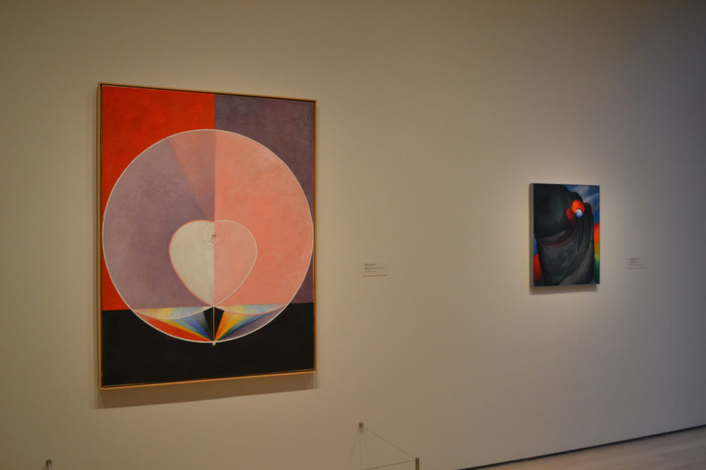
Hilma af Klint’s The Dove, No. 2, Series UW, Group IX, 1915, and Georgia O’Keeffe’s Lake George, Coat and Red, 1919.
In a room titled “Ca. 1913” (art-historical terms have for the most part been sidelined in favor of such looser, more approachable ideas, though wall texts remain as dry as ever), two color-radiating paintings, by the standby American Georgia O’Keeffe and the lesser-known Swedish mystic Hilma af Klint, hang side-by-side in compelling conversation.
A few rooms over and, visible through Marcel Duchamp’s standing glass piece, To Be Looked at… (1918) is Family Portrait, II (1933), by Duchamp’s onetime French student and longtime friend, Florine Stettheimer, whose practice lends inspiration for a whole gallery. Stettheimer’s rarely seen theatre-costume designs are on hand, joined by collages from the Dada geniuses Hannah Höch and Elsa von Freytag-Loringhoven, plus a large 2008 work on paper by the contemporary polymath Frances Stark. It’s a joyous menagerie of works about self-presentation, ornamentation, and play.
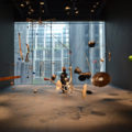
Also joyous is seeing works that you never knew MoMA owned, or only recently came to own, or that you have only seen in small images on its website. A “Surrealist Objects” room holds an otherworldly group scene by the Spanish painter Remedios Varo plus paintings by Dorothea Tanning and Leonora Carrington; a purpose-built space dedicated to live work in the addition houses Rainforest V (variation 1), 1973–2015, a hanging constellation of bizarre instruments by David Tudor and Composers Inside Electronics Inc.—the sleeper hit of the hang. And a treasure-filled special exhibition holds abstract works from South America that were recently donated by Patricia Phelps de Cisneros.
In the best of its new thematic galleries, MoMA is inching toward, however hesitantly, a kind of art viewing that is unashamedly about aesthetic pleasure, that draws on challenging and unlikely associations, and that is unencumbered by strict definitions of geography or medium. (Works of design, architecture, and art cohabit in some spaces, rather comfortably.) But even as it does all this, it has kept its largely chronological narrative of modernism intact. Where things go awry is when this narrative gets to the present.
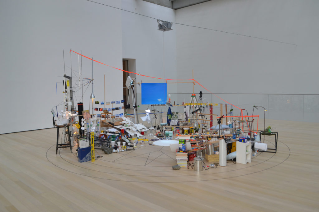
Sarah Sze’s Triple Point (Pendulum), which resides in a show of large-scale works on the sixth floor of MoMA.
The Forever Now
Eleven large installations have been plunked down in as many rooms on the top floor of MoMA, for an exhibition called “Surrounds.” It functions as a kind of caesura after the sprawling collection rooms below, and some of the work is superb (Arthur Jafa, Sarah Sze, Mark Manders), but the overall effect recalls art fair sectors devoted to large-scale work, or just the sense of being trapped in a very well-funded storage space. One wishes that MoMA curators had found a way to integrate those pieces into the regular flow of the galleries, as they have done with a key Joan Jonas installation or even a screening room of essential Andy Warhol films down below.
The remainder of the contemporary—which is to say, post-1970—work remains on view in its usual home, the way-too-tall galleries on the second floor. It is predominantly tasteful fare from plenty of high-profile, MoMA-approved artists (great ones, to be clear), like Wolfgang Tillmans, Mark Bradford, Robert Gober, and Nairy Baghramian. While there are some potent moments, like a concise survey of Chinese standouts, a Gretchen Bender video suite, and a room that joins Cecilia Vicuña, Mrinalini Mukherjee, later Jo Baer, and more, it is a predictable, conservative hang. (The best recent work on view is easily the Pope.L survey nearby.)
The presentation also highlights some continued, glaring omissions on the part of MoMA. That great Basquiat painting? It’s borrowed from a private collection: the museum still does not have one.
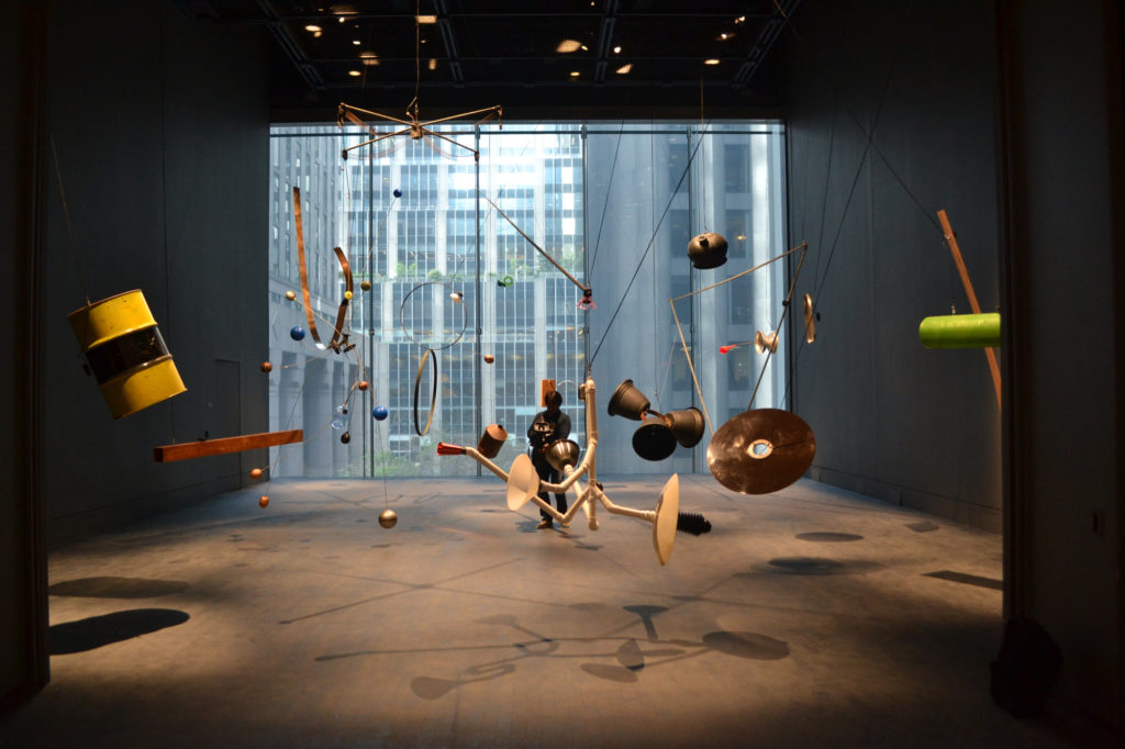
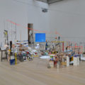
David Tudor and Composers Inside Electronics’ Rainforest V (Variation 1), 1973–2015, in the museum’s new Studio space.
In any case, it is in places like the contemporary galleries that one is reminded of how incredible, and perhaps unachievable, MoMA’s mission is now. As the art industry grows ever larger, with more fairs and biennials, efforts to summarize present trends become quixotic. For seasoned New Yorkers, the contemporary fare will seem woefully basic (some may remember, for instance, that the jaw-dropping room of Richard Serra sculptures was on view at David Zwirner just four years ago). I don’t envy the curator’s task of balancing the known and the new, but right now the rooms that house works post-1970 feel staid.
With the official opening less than two weeks away, I have been getting served MoMA ads on the internet that quote John Cage: “I can’t understand why people are frightened of new ideas. I’m frightened of the old ones.” It’s a compelling sales pitch, but a misleading one. MoMA still represents a very old idea: a grand museum in the center of one of the richest cities in the world serving up masterpieces, charging an outrageous price for tickets ($25), and growing ever larger.
MoMA looks great now, and there are some exciting signs of change. But while walking through its sparkling new interior, I found myself imagining alternatives for the $450 million that created it, like filling in some of its baleful atrium space with even more collection galleries, building little MoMAs elsewhere that could be run by local artists, raising salaries for staffers, buying a boatload more art, or just nixing that admission fee.
Maybe next time.
View more works from the newly expanded MoMA, below.
- In the atrium, in the center of it all, an effervescent installation by Haegue Yang, “Handles.”
- David Tudor and Composers Inside Electronics’ Rainforest V (Variation 1), 1973–2015, in the museum’s new Studio space.
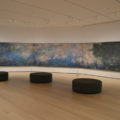
- The most classic of the classics: Claude Monet’s Water Lilies (1914–26) in a room for the artist that holds two more works that are not pictured.
- In the nearly empty lobby, a Philippe Parreno glows.
- Two old comrades side by side: Grace Hartigan’s Shinnecock Canal (1957) and Willem de Kooning’s Untitled XIX (1977).
- Yoko Ono’s PEACE is POWER (2019), a new commission for the museum.
- Sarah Sze’s Triple Point (Pendulum), which resides in a show of large-scale works on the sixth floor of MoMA.
- “Paris 1920s,” with an Eileen Gray at left and, greeting visitors, a Man Ray chess set.
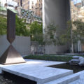
- The garden, which can now be entered from the south side, as well.
- A feast: an installation view of “Artist’s Choice: Amy Sillman—The Shape of Shape,” for which the artist has mined the museum’s collection.
- Not a bad sight line: from left to right, Roy Lichtenstein, Judith Scott, and Geoffrey Hendricks.
- The view across West 53rd Street, into the belly of the beast.
- Matisse’s The Red Studio with Alma Thomas’s Fiery Sunset (1973). A survey of the latter’s work awaits at Mnuchin Gallery right now.
- “Responding to War.” Naming its galleries, the museum has eschewed the titles of movements and styles in favor of more approachable themes.
- Works by Jacques Villeglé, Katsuhiro Yamaguchi, and Romare Bearden
- “New Monuments,” with Lynda Benglis up front and Jackie Winsor in back.
- Hilma af Klint’s The Dove, No. 2, Series UW, Group IX, 1915, and Georgia O’Keeffe’s Lake George, Coat and Red, 1919.
- Works by Anne Truitt, Dan Flavin, and Rasheed Araeen.
- Maria Martins’s The Impossible, III (1946) and Sonja Sekula’s The Town of the Poor (1951) in “Out of War.”
- Picasso’s Les Demoiselles d’Avignon (1907) at left with Faith Ringgold’s American People Series #20: Die, 1967.
[ad_2]
Source link


