[ad_1]
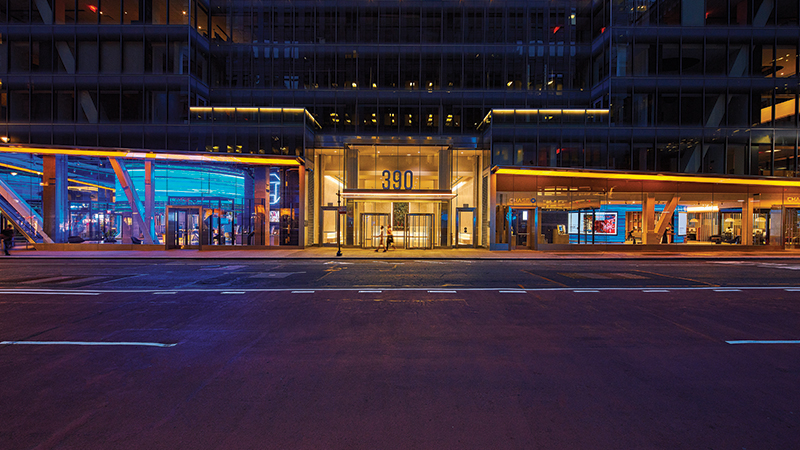
Chase’s flagship branch at 390 Madison in Manhattan. Plebes to the left; private clients to the right.
COURTESY CHASE
Ah, Midtown Manhattan, the neighborhood that New Yorkers love to hate. It is crowded, overflowing with hard-charging businessmen and sauntering tourists. It is ugly, with its endless Starbucks and Sweetgreens and corporatized public-private parks. And looming over it all is Trump Tower, buttressed by machine-gun-wielding cops. All in all, not a positive place to be.
But as the Museum of Modern Art reopens today, in its remarkable new form, Midtown is the center of the city’s art world. Thankfully, there is good news: it is suddenly home to a bounty of new—and newly refurbished—art offerings. For better and worse, art’s future can be glimpsed on a short stroll through the neighborhood—as can its past. Join me.
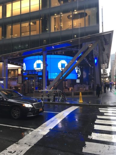
Metal, glass, cement, and sharp edges: the flagship.
PHOTO: ANDREW RUSSETH
First, the bizarre: the grand new Chase flagship branch that stretches most of Madison Avenue between East 46th and 47th Streets—all metal and glass, cement floors, soaring ceilings, huge neon logo, and a bevy of LED screens—is an Apple Store with a higher menace quotient, and it executes, with disturbing effectiveness, various prevailing contemporary art strategies. Devoted gallerygoers should brace for an intense, and not entirely pleasant, sense of having been here before.
Having opened in June, it is the first in a series of ambitious flagships that Chase will build. Its CEO, Jamie Dimon, has said the company’s aim is to create a “community center,” while another Chase exec has described it as an “experiential location,” adopting the language of immersive art installations like Skyscapes and Rain Rooms. (Yet another exec dubbed it a space for “money conversations,” minting a phrase I have been trying unsuccessfully to forget since reading it.)
Hanging above the branch’s ample open space is a gargantuan 360-degree screen that recalls Hito Steyerl’s video-in-the-round at the current Venice Biennale, bearing digital blue waves. It serves up Chase ads with Kevin Hart and Serena Williams, projects Barbara Kruger-worthy slogans (“MAKE MORE OF WHAT’S YOURS®”), and—why not?—provides updates on the city’s decrepit public transportation service. Still more screens are mounted inside the circle.
It is tempting to simply bask in the room’s dark blue glow, but should you want to take out cash, high-tech ATMs with sprawling touch screens await. There are also real-life tellers behind tall freestanding tables, like representatives in the Adrian Piper piece where you can sign contracts committing to certain declarations (“I will always be too expensive to buy” is one). And there is a ton of seating, including circular pods that would look at home in a luxe restaurant or Jorge Pardo furniture show and lounge chairs arrayed around low tables. Some bear art books, for Olafur Eliasson, Tippet Rise Art Center, and so forth. (Curiously, these sit underneath fake little potted plants, suggesting that reading is not exactly the goal here.)
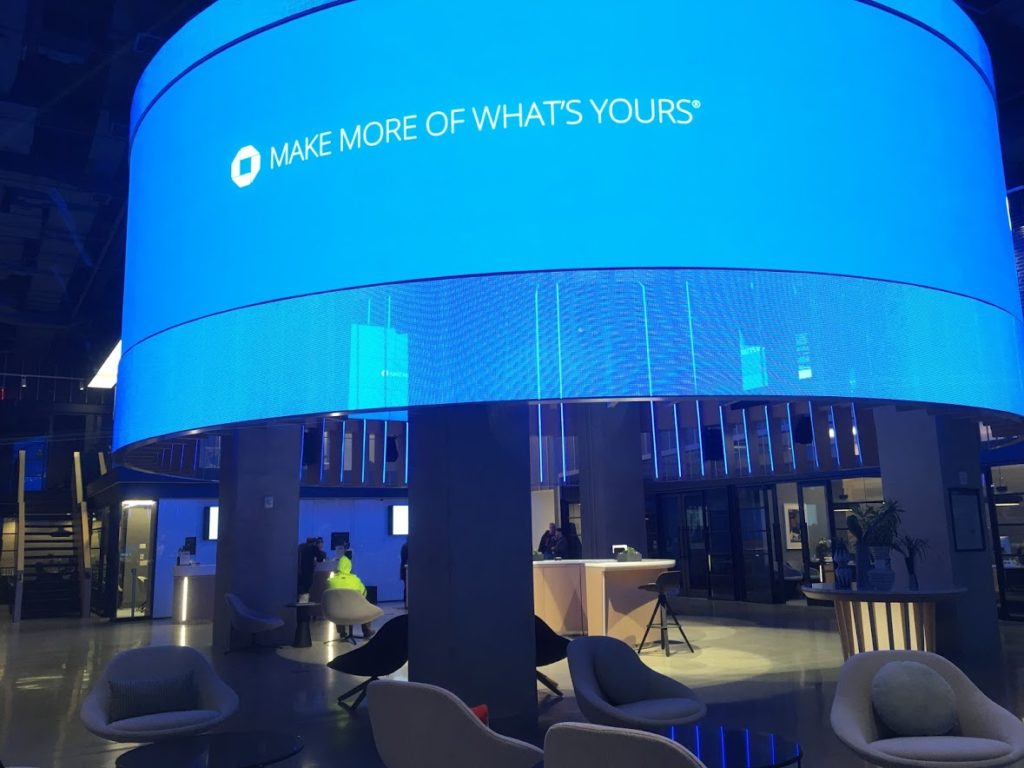
Make the most of what’s yours.
PHOTO: ANDREW RUSSETH
Actual artworks—in reproduction—are visible in a Chase Private Client section at the north end of the block. Here, additional curving screens display pieces from the JPMorgan Chase Art Collection, one after another. (No ads or subway news for the rich here, I will note.) Watching this impressively cosmopolitan group of artworks glide by is a hypnotic experience: John Baldessari and Kenzo Okada (love him!), followed by Graciela Iturbide, Tseng Kwong Chi, and Marta Minujin. It’s a shame that Betty Parsons isn’t around today to see one of her charismatic painted sculptures alighting before Chase clients, letting them now that this is a bank that is serious about art. (Disclosure: I am a devoted Chase customer.)
What to make of all this? Art is, of course, the lingua franca of both aspirational and elite capitalism today, so it’s difficult to feign any sense of surprise (forget anger). I left this seamless, shimmering world feeling amused and strangely satisfied, though a little put-in-my-place.
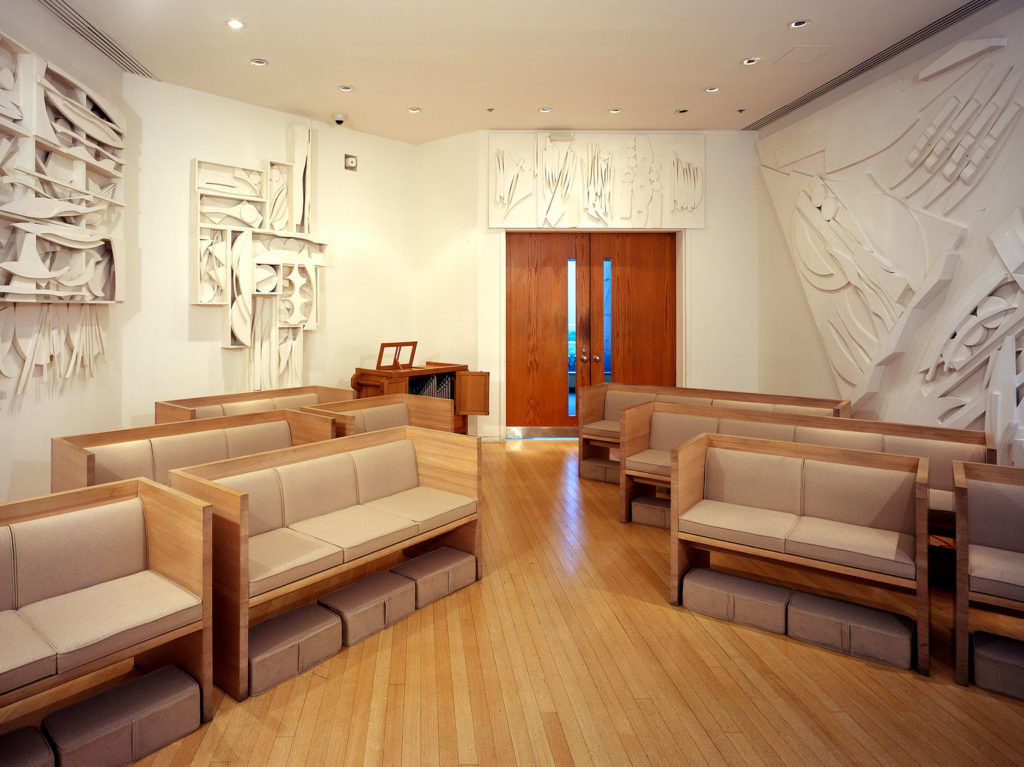
Louise Nevelson’s Chapel of the Good Shepherd, 1977, at St. Peter’s Church.
Next, a palate cleanser. One of Midtown’s most obscure treasures went back on view last month after the first phase of a restoration project: Louise Nevelson’s Chapel of the Good Shepherd, which the artist tucked into a corner of Saint Peter’s Church in 1977. It’s a tranquil redoubt in a hectic area. Think of it as the equally wondrous opposite of the sculptures she debuted downtown the same year in what is now Louise Nevelson Plaza in the Financial District. Those pieces, all black, are giant and imposing: tough beauty emerging from darkness. The chapel, in contrast, is filled with wall reliefs that are intricate, sharp-edged, asymmetrical, free-flowing—Nevelson at her most frenetic and inventive—and they are all white, so that an unusual harmony prevails, as in Gershwin or Coltrane. On a recent visit, I found myself alone, and felt like the luckiest guy in New York.
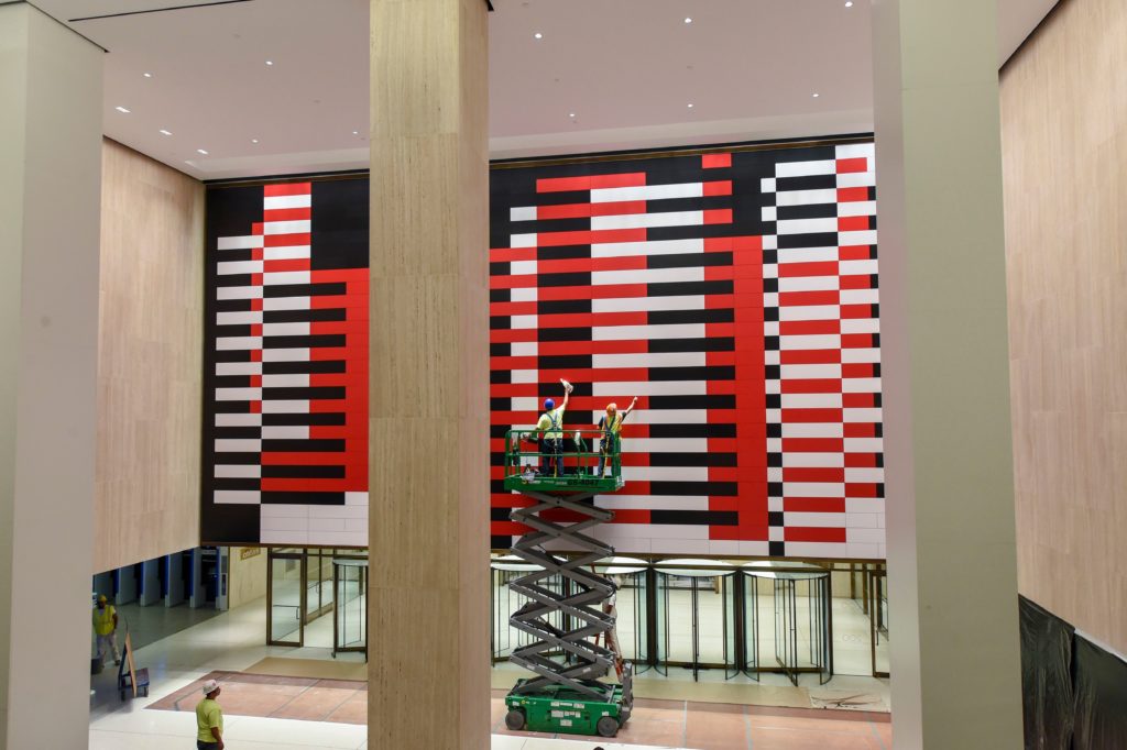
The freshly installed replica of Josef Albers’s Manhattan at 200 Park Avenue. Tishman Speyer and Irvine Company engineered the display with the Josef and Anni Albers Foundation. DIANE BONDAREFF/AP/SHUTTERSTOCK
Over in Grand Central Terminal, many thousands of people are now lucky every day to pass underneath a pulse-quickening abstract mural by Josef Albers in the lobby of the MetLife Building. It previously resided there from 1963 until 2000, when it was unceremoniously removed. (“It just doesn’t work for us anymore,” MetLife said at the time.) Titled Manhattan, it is an astonishing 55 by 28 feet, with a buzzing, syncopated grid—black, red, and white—that conjures the interlocking, overlapping forces of the city, while taking on some Op verve as you walk before it. The original piece, commissioned from Albers (by the building’s then-owner, Pan Am), was filled with asbestos, so what is on view is a meticulous re-creation, overseen by the Josef and Anni Albers Foundation, installed a few weeks ago. The piece suggests a giant weaving in progress—countless threads coming together, then moving apart, new forms coming into being all the while.
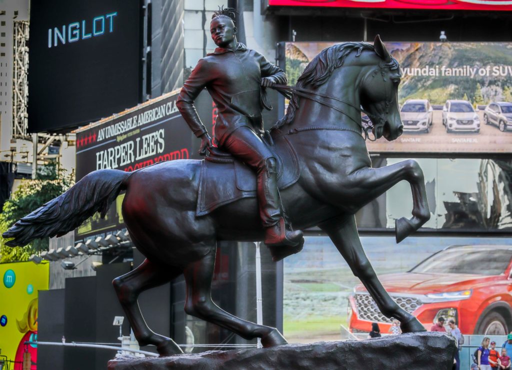
Kehinde Wiley’s Rumors of War in Times Square.
BEBETO MATTHEWS/AP/SHUTTERSTOCK
If there is any artwork in the area getting more eyeballs on it every day than the Albers, it has to be Kehinde Wiley’s majestic equestrian statue, Rumors of War (2019), which debuted in late September in Times Square, where it will have pride of place until it decamps at the end of November for its permanent home outside the Virginia Museum of Fine Arts in Richmond. The President Obama portraitist has placed a young Black man with dreads atop the mighty beast, which raises its front-right leg. Wearing a hoodie and Nikes, he holds the reins in one hand as he looks back over his shoulder, perhaps giving a last look before galloping off, a citizen called toward some noble cause. (It is modeled after a statue of Confederate general J. E. B. Stuart in Richmond that has been the subject of protests.) Amid countless flashing ads on Broadway, the bronze looks vital, poignant, and a touch solemn—timeless, in a word. In Virginia, one suspects that it will make the Jim Crow–era monuments look even more revolting and embarrassing than they do now.
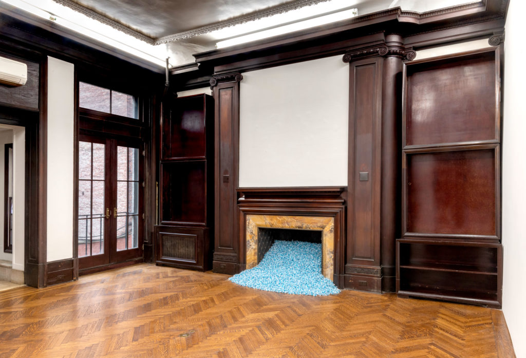
Installation view of Felix Gonzalez-Torres’s “Untitled” (Revenge), 1991, at Front Desk Apparatus. PHOTO: ADAM REICH/FRONT DESK APPARATUS
A monument—and memorial—of a very different kind awaits at Front Desk Apparatus on East 37th Street in the form of Felix Gonzalez-Torres’s “Untitled” (Revenge), 1991, on view through the end of the month. It consists of 325 pounds of blue candy, the combined weight of Gonzalez-Torres and his partner, Ross Laycock, who died of AIDS-related causes the year he made the piece. FDA has been reinstalling the peppermint sweets, which are free for the taking, in a new configuration each week—first in a thin layer on the floor, then spilling from a fireplace. The candy spills are some of the greatest artworks of the late 20th century—ingeniously concise and generous—and Revenge is both a tribute to a relationship and a kind of Trojan horse. As the artist famously once said, “Some homophobic senator is going to have a very hard time trying to explain to his constituency that my work is homoerotic or pornographic.” It’s tempting to read the work’s sharp-edged title as an acknowledgment that, as such politicians fall from power and vanish into history, the work will still be moving and delighting new waves of people. The artist trusted that they would understand.
[ad_2]
Source link

