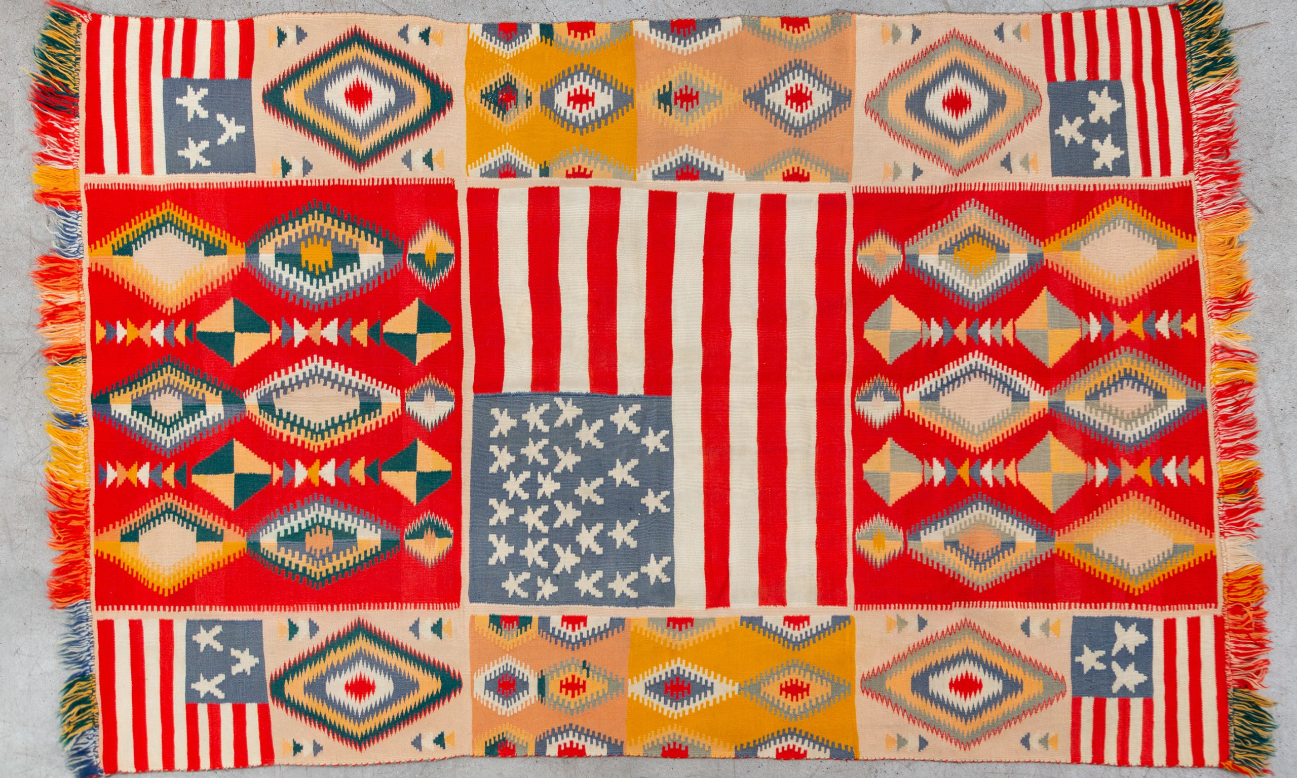
A unique example of a transitional-phase Navajo weaving in the "Germantown" tradition, with American flag panels and eye-dazzlers (1868-1910) by an unknown artist. Courtesy The Drawing Center.
Ornamentation can be a polarising presence within the white cube—cursive corners, patterned walls and pastel hues go against the industry’s standard sleek lexicon. The Drawing Center’s new exhibition, The Clamor of Ornament: Exchange, Power, and Joy from the Fifteenth Century to the Present, conquers the notion of embellishment from within and displays centuries-spanning examples of ornamentation from diverse geographies and histories.
Japan’s Sarasatic-style colour swatches from the late 18th century are hung steps away from Dürer’s intricate Ottoman-inspired 16th century woodblock print, while the 19th century pen-and-ink studies of decorations inside the Taj Mahal lead the way downstairs, where cake decoration drawings by the Great British Bake Off artist Tom Hovey are displayed on ruby-coloured walls.
A woodblock print by Albrecht Dürer after Leonardo da Vinci, titled The First Knot, Interlaced Roundel with an Oblong Panel in its Center (before 1521). The Metropolitan Museum of Art, George Khuner Collection, Bequest of Marianne Khuner, 1984. Courtesy The Drawing Center.
For the show’s curator, Emily King, de-centring the history and the present was a major challenge, “especially when you make the entire globe your focus and face the risk of being ‘a tourist’”, she says. With a healthy dosage of “happenstance” and year-long research, King committed to “the idea of communication through design and a purpose of currency”, juxtaposing the ancient with the contemporary, or east with west.
“The more we looked at things, the more the roots seemed circular and interchangeable,” she says. “Destroying categorisation and splitting up the works even by the same artists was the appropriate decision.”
Contemporary artist Wendy Red Star’s red-coloured drawing onto Charles Milton’s black-and-white photograph of an Apsáalooke leader and an 1875 Tiffany & Co. watercolour of an urn created as a celebration of the era’s cotton industry both speak to painful histories. In both instances ornamentation raises questions rather than simply serving the purpose of beautification, though through opposite perspectives of the oppressed and the oppressor.
Owen Jones, The Grammar of Ornament (1865). Book with 100 chromolithograph plates. Courtesy of Michele Oka Doner. Photo: Daniel Terna.
The nearly 200-work show’s title reflects this dismantling of a hierarchical approach towards value. Riffing on Welsh architect and theorist Owen Jones’s Victorian-era book The Grammar of Ornament, King’s curation offers an antithesis to Jones’s ideas about categorisation in design with an open-ended look at transhistorical narratives of beauty.
King’s former positions at the Victoria & Albert Museum and Frieze magazine came in handy to concoct a multifaceted understanding to her hefty subject matter, not to mention carte blanche to blend distinct tastes and eras. “The freedom of an art museum has been brilliant,” says the design historian, who thinks “migrating different design contexts in this way would be a challenge at the Design Museum or V&A”.
Vittorio Accornero de Testa’s 1973-dated scarf design for Gucci and Ethel Dougan’s early-20th-century watercolour drawings of zigzagged prints, titled Saddle Blanket, are exhibited in close vicinity, while another room hosts an unknown Navajo artist’s actual woven yarn blanket from the mid-19th century with similarly geometric motifs and an American flag.
Vittorio Accornero de Testa for Gucci, Flora Scarf (around 1973). Photo: Daniel Terna. Courtesy The Drawing Center.
Questions of ownership, originality and resonance were inevitable in such an expansive exhibition, but King is less interested in the claimed owner of a pattern or an idea. “If power was equally distributed, copyright wouldn't be such an issue, yet so often copyright works in the favour of the powerful not the powerless,” she says.
While the show is replete with delightful vignettes spanning many centuries and miles, the experience is made more easily navigable by British firm Studio Frith’s colourful identity and wall label design. If the elegantly cursive form of wall label holders seems familiar, they are in fact based on a common Chippendale motif.
“I’ve always been interested in communication and the flow of information in two dimensions,” King says. “Ornaments strike me because they flow so fast yet people pick up on them.”

