
[ad_1]

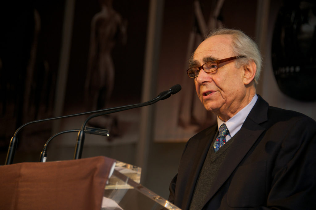
Irving Sandler.
©INTERNATIONAL SCULPTURE CENTER
During the late 1950s and early 1960s, the art critic Irving Sandler, who died earlier this month at age 92, was an editorial associate for ARTnews. In that time, he produced a few reviews for each issue, giving a host of artists—Grace Hartigan, Robert Rauschenberg, and Robert Motherwell among them—some of the first major notices they received during their lifetimes. To honor Sandler’s legacy, excerpts from his ARTnews reviews, as well as two from this magazine’s “Paints a Picture” series (for which Sandler produced one of its most important entries, about Joan Mitchell) and a letter to the editor, are republished below. —Alex Greenberger
“Mitchell paints a picture“
October 1957
[Joan] Mitchell is reticent to talk about painting, so in order to approach the underlying processes in her work, the Socratic method was needed, rejecting some classifications, modifying or keeping other. She dislikes compulsive attitudes toward nature, which for her has a simple meaning and beauty. “I feel like a little child coming up out of the basement and saying: who put the sidewalk there, who put the tree there?” Nature—country and city—is that which is outside of her; it is the theater in which she lives, her décor. But if nature supplies the raw material, the artist then sifts it through memory to convert it into the essential matter of her art. There are those fleeting moments, those “almost supernatural states of soul,” as Baudelaire called them, during which “the profundity of life is entirely revealed in any scene, however ordinary, that presents itself before one. The scene becomes its symbol.” Miss Mitchell attempts to paint this sign, to re-create both the recalled landscape and the frame of mind she was in originally. Memory, as a storehouse of indelible images, becomes her creative domain.
“Editor’s letters”
December 1958
[Allan] Kaprow shows perceptively [in his essay “The Legacy of Jackson Pollock,” published in the October 1958 issue of ARTnews] that Pollock was anything but a failure. However, to claim that Pollock’s work was different from past art does not mean that he “destroyed” painting. For whom—“His contemporaries, such as Motherwell, Hofmann, de Kooning, Rothko . . . Still”? The innovations certainly changed painting; they never ended it, certainly for these artists. The idea that an artist has to go past Pollock is offensive; it seems to have more to do with racing than with art. And if, indeed, these pictures reach out into life, why say that artists must abandon painting and “become preoccupied with and even dazzled by the space and objects of our everyday life, either our bodies, clothes, rooms, or if need be, the vastness of Forty-second street . . .” If Kaprow wants to create a new synthetic art of all the senses, that is a marvelous, old nineteenth-century idea, but it is cheap to treat Pollock as a stepping stone for Kaprow’s own still unrealized art.
“Reviews and previews”
February 1959
Adolph Gottlieb had his most impressive show to date [at Emmerich Gallery]. In large, vertical paintings, two centrally located forms, one above the other, are placed on a single color ground. The lower shape has jagged edges; there is an unearthliness in the way the paint sits hard and flat on the canvas. The upper shape, floating immaterially within a halo, is more rounded; its center glows and its rim sputters like hot coals. The new pictures combine many components of past works. Landscape and symbolic space are fused.
“Reviews and previews”
April 1959
The gallery becomes an environment [in Robert Motherwell’s show at Sidney Janis Gallery]; the viewer is engulfed in the experiences of the artist—his emotional explorations and his image of the places in which such events occurred. Black and ocher are the predominating colors, particularly black—the “color” of so much New York painting, of Spain and elegance, of the bull, sacrifice and nightmare and, surprisingly, love. Motherwell’s environment is complex and open. It reveals as many possibilities as decisions. He is not afraid to move in many directions at once or to leave loose ends. Emotional intensity and confidence in the importance of his experiences endows even the unresolved pictures with presence.
“Sander paints a picture”
September 1959
When [Ludwig] Sander starts a painting, he feels confronted by the “tyranny of the canvas edges.” The eventual size and shape of any element is governed by what he sees elsewhere on the surface. As he paints one part, he adds substance to some other section at the edge of vision. This “painting out of the corner of the eye” causes the forms to move in their own place. Sander’s concern with optical activity in art attracted him to Cubism. Not all Cubism appealed to him; he was uninterested in the flat-pattern variety, but Picasso’s The Three Musicians made a strong impression. What fascinated him about the two versions of this pictures was the equivocal manner in which color shapes maintain their places, yet break in and out of the figures; they appear to be in motion. The visual sensation that underlies Sander’s work is not obvious or agitated. It is evocative because it is not spelled out and is capable of producing sympathetic vibrations in the eye of the viewer.
“Guston: a long voyage home”
December 1959
[Philip Guston’s] earlier works, painted before 1954, were more fragmented, less explicit. They were immersed in an ethereal light, an illimitable atmosphere that seemed to express a yearning for the absolute. Since then, Guston has worked in depth and has expanded the small shapes into larger and more complex areas. It is as if he has moved close to his forms; they are more intimate and burdensome—massive aggregates of impetuous details. The shapes have opened up to the edges of the canvases. They do not displace the atmosphere but breathe it, allow it to sift in and between them, to grey their colors. The atmosphere in turn has partaken of the density of the form; it becomes a solid smoke tinged with lyric accents. The palpability in recent works supplies the human balance, the substance of man, rich in feeling, pulsing in and with ether.
“Reviews and previews: New names this month”
January 1960
[John] Chamberlain does not use objects as he finds them but cuts and bends them into abstract forms. Yet his pieces retain the look of junk. The haphazard enhances the formal. The constructions are elegant, but they have a painful quality. They barely survived the crash—metal entrails wind in and out—and yet they strut.
“Reviews and previews”
April 1960
Robert Rauschenberg, in recent construction-collage paintings, develops elements found in earlier works in new ways. He still uses debris of the city with diabolic wit and delight. But if Rauschenberg continues to make found objects precious, he treats them less in terms of private sentiments and associations, more in terms of the environment from which they come—the street. The rawness of the city asserts itself increasingly in his work. The ugly, dirty piece of crumpled, junk metal “bulldozer drapery” that dominates Allegory [1959–60] may primp itself in a plastic mirror, but nothing it can do will make it pretty.
“Reviews and previews”
November 1962
[Grace] Hartigan seems to be increasingly involved with Matisse’s hedonism and pictoral ideas. At times, she quotes the French master directly and frequently uses the entire surface as a field of color whose flatness is accented by the canvas plane. She is interested in arriving subjective states of feeling in the process of painting, and to this end, will dissolve the appearances of her subjects. In these striking canvases, Grace Hartigan succeeds in being gentle, light in spirit and even sentimental, without sacrificing the boldness, vigor and power.
[ad_2]
Source link