
[ad_1]
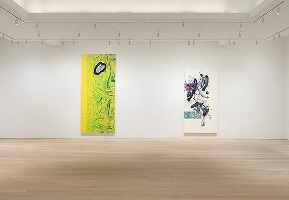
Wave your hand slowly and you can see it moving through space. Wave it quickly enough and it starts to look like a big, solid blur. Motion, in other words, can register as motionlessness—not a groundbreaking point, perhaps, but one that’s worth keeping in mind when you look at the new abstract paintings David Reed exhibited at Gagosian. His brushstrokes, or what look like brushstrokes, race over the canvas with such speed, or what looks like speed, that they achieve a smooth, opaque stasis.
Small wonder that Reed, who turns seventy-four this year, loves movies. A film camera translates movement into a series of static images; looking at the frames of Eadweard Muybridge’s The Horse in Motion (1877), sometimes interpreted as the first motion picture, you feel kinesis and statuesque stillness at the same time, a paradox that applies equally well to Reed’s #720 (The Prodigal Son), 2013–19, which decorated the Gagosian lobby for the duration of the show. Reed has at times appropriated imagery from famous films, but more often his work recalls film’s formal elements. His long, narrow abstract paintings, divided via thin streaks of paint into cells with the familiar 4:3 ratio, suggest celluloid, and when he produces larger, vertically oriented canvases, he’ll often paint in miniature copies of his own images, arranging them horizontally like loose strips on a flatbed editor. Two decades into the twenty-first century, he paints as if the digital revolution never happened.
Related Articles

Studying the canvases in Gagosian’s palatial chambers, it was easy to forget that Reed’s style was born in a moment of crisis. Very roughly speaking, New York painting in the late 1970s demonstrated either the bloat of Pop art or the emaciated legacy of Abstract Expressionism. In the midst of this stagnation, Reed made it his mission to revitalize the brushstroke, which AbEx had exalted and Pop smirkingly rejected. The oil paintings in his bombshell New York debut (Susan Caldwell Gallery, 1975) featured long, viscous lines of red and black that crawled rightward with the calm insistence of sheet music. From here arose a body of work neither glib nor earnest, personal but not quite gestural, technical but not too showoff-y, bolstered by fancy allusions to film and Baroque color theory.
This body of work has been extravagantly, sometimes comically praised. In 1994, Dave Hickey turned off his famous bullshit detector to pen a piece in which he linked Reed to everything from sixteenth-century theology to SoCal car culture. It’s certainly refreshing to encounter a painter who seems to have gone his whole career without being tempted by Warholian irony. But I wonder if critics, impressed with his bold leap forward, are too quick to credit him with a smooth landing every time.
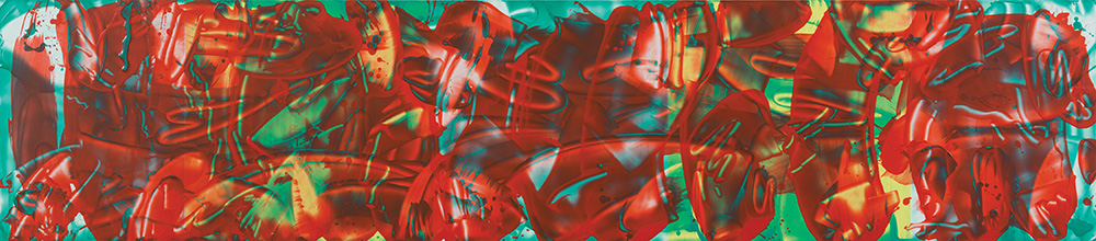
Photo Robert McKeever.
The more time I spent with Reed’s new paintings, the more expendable their nods to celluloid started to seem. His brushstrokes, meanwhile, stride boldly into the frame, do their little dance, and then, more often than not, lose momentum. The calligraphic black ribbons of #712 (2010–11/2018–19) strut and fret up, down, right, left, and end in cute little ta-das that come off as too neatly balanced within the frame. More often (as in #721 and #717), his lines disappear in a thicket of garish complementary colors. This is what Manny Farber had in mind when he railed against the “square, boxed-in shape and gemlike inertia of an old, densely wrought European masterpiece.” Maybe that doesn’t seem so bad (Farber’s insults have a funny way of sounding like praise), but compare Reed’s latest paintings with the ones he showed in 1975. In the earlier works, motion and stasis are locked in a struggle that dazzles the eye and the mind. This time around, stasis dominates.
This article appears under the title “David Reed” in the March 2020 issue, pp. 79–80.
[ad_2]
Source link